
Case Study on the Logo designed for SPBS
Any designer will understand that becoming a graphic designer is one struggle and building a career in it is another. I am here sharing my own story in the form of a Case Study on the logo designed for SPBS
By ZAK Designs
Everything we create at ZAK Designs has a why and how and that is what you will get to know in this case study page.
While the why covers the reason behind that particular design, colour or shape; how tells the way we made it.
To us it is not just about designing, it’s about making something great. It is about adding a meaningful concept because it is not the design but the concept behind it that connects to people.
Each and every time the goal is to take our creativity to another level; to make something simple, minimal, and inspirational.
Check out the case study, you will love it!
Any designer will understand that becoming a graphic designer is one struggle and building a career in it is another. I am here sharing my own story in the form of a Case Study on the logo designed for SPBS
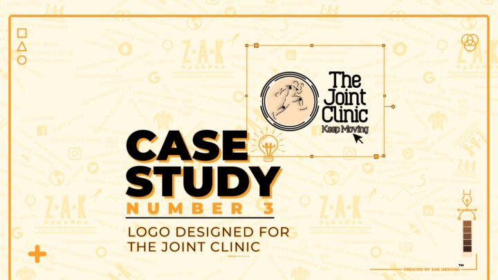
This is the second logo I made as a graphic designer and there is a very interesting story behind it. A concept and a bunch of reasons on why and how this was made. Let’s begin with this Case Study on the Logo Designed for The Joint Clinic.
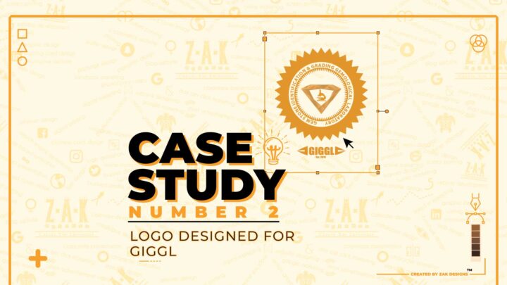
In this case study, you will get to know the story as well as how and why I made this logo for GIGGL, the concept behind it and much more.
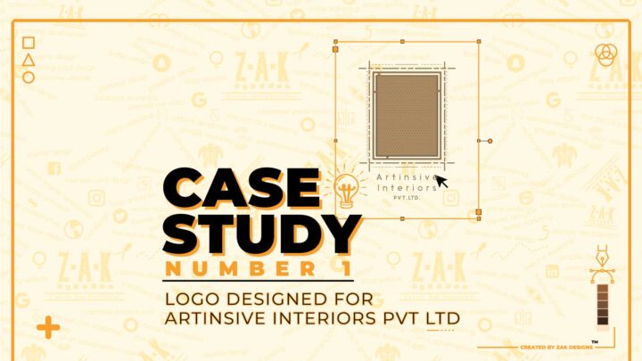
In this Case study on Logo designing for Artinsive Interiors, we have discussed why and how we made this logo and the concept behind it.